KineBody Pro Instructions:
(last updated 240426)
Adjusting Layout
Color Coded Sections
This page applies to both the Webapp and Android editions of KineBody Pro, and much of the content is the same for both. However, some content is platform-specific, so different background colors are used as follows: 'orange' for Android App, 'yellow' for Webapp, and no color (white) for content common to both.
Overview
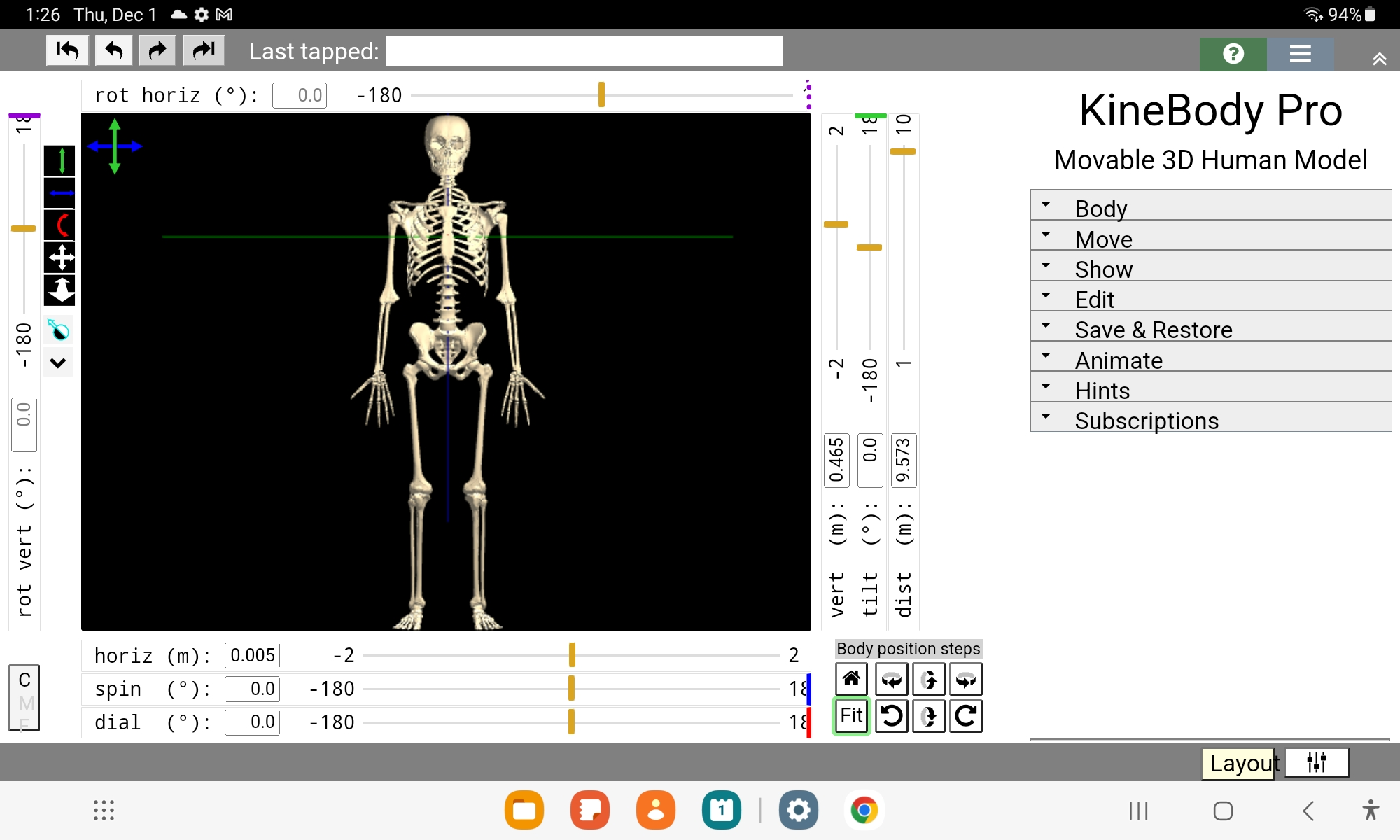
The KineBody Pro window contains two major types of content: a central 3D viewing area, and an outer area for controls (Figure 1).
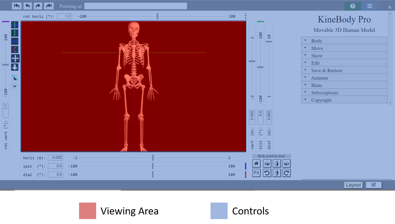
For the Webapp, these two ‘parts’ are normally sized to fill whatever window or screen size you provide for them. For the Android app, these parts will also fill your screen as much as possible; Android may reserve some space for its major controls, e.g., in toolbars at the top & bottom of the screen. KineBody Pro includes multiple features for modifying the layout (i.e., size & arrangement) of the viewing area & controls. This page describes these features & how to use them.
The layout modification features fall into two main categories, Automatic and Custom:
Automatic Layout Features
When you use KineBody Pro for the first time, or on a new screen, the default sizes for the viewing area & controls are set using predefined proportions, i.e. they appear relatively similar regardless of the screen size (Figures 2a & b).
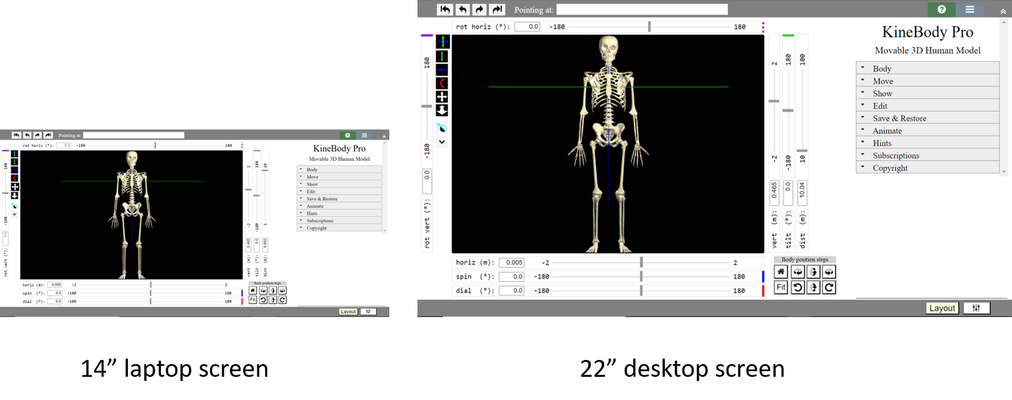
If you're using the Webapp edition, the layout will be adjusted further if you change the window size. If you reduce or enlarge the window, the KineBody Pro app layout will be automatically readjusted, using logic that differs from the 'proportional' fit described above:
The controls will be resized ‘as little as possible’. For example, as window size changes, buttons remain fixed in size; whereas sliders maintain a constant ‘thickness’, while their length may increase or decrease (Figure 3).

Figure 3. Controls maintain size, when window is resized. The outer controls area will normally be arranged to fill to the outer edges of the window, and the 3D viewing area is then maximized to fit inside the the controls area.
Generally, the resizing mechanism strives to prevent gaps, interference, or overlap, between the various controls and viewing area. Some enhancements & exceptions to this logic are discussed in later sections.
*Caveat: Some interference or overlap is unavoidable, if you shrink the window to a very small size, or if you use extreme values for some of the custom parameters. The parameter ranges are intened to handle a variety of screen sizes, and the full range of values may not be appropriate for your particular screen. You’re welcome to experiment with the layout settings, but we recommend you back-off from any values that yield a 'corrupted' layout.
Some controls may automatically show or hide or relocate, depending on what you’re working on. For example, playback controls for animations or background videos will appear only if you’re using one of those features, and the Step Rotation buttons may relocate depending on whether the slider banks are shown or hidden.
Custom Layout Adjustments
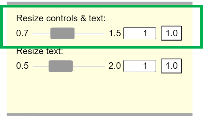
In addition to the automatic size adjustment just described, KineBody Pro also allows you to customize many aspects of the window content. For instance, you can change the size of all the KineBody Pro controls (as a group): increase them for improved usability on smaller screens, or reduce them to provide a larger 3D viewing area (Figure 4). Or, you can change the font-size for text labels on the controls, for improved readability.

Another adjustment allows you to enlarge or reduce the 'colored arrow' cursors that appear in the viewing area, when dragging with a mouse. These cursors appear as arrows, colored to indicate which rotation axes will be affected by the drag movement, and oriented to show you which direction to drag, for rotation about a particular axis. Note that these adjustments are useful only for mouse users, as there are no cursors for touch screens.
You can also specify custom dimensions for the 3D viewing area. This capability is provided primarily as a way to specify the dimensions of ‘.png’ images created using the ‘Save Image’ button, because the images are identical in shape & content as the viewing area – i.e., ‘what you see is what you get'. That is, by specifying the viewing area size, you can control the saved image size. The actual image dimensions are scaled from those of the viewing area, with the scale factor determined by your app edition (Webapp or Android), and their respective utilities for adjusting zoom level. (For more information, please see the Miscellaneous section and the Details part of the Resize Controls & Text section, below).
Additional ways to customize the layout include:
Show or hide sliders (as a group)
Add a margin around the controls area (useful for touch input)
‘Reset’ the layout (more below)
The Layout panel
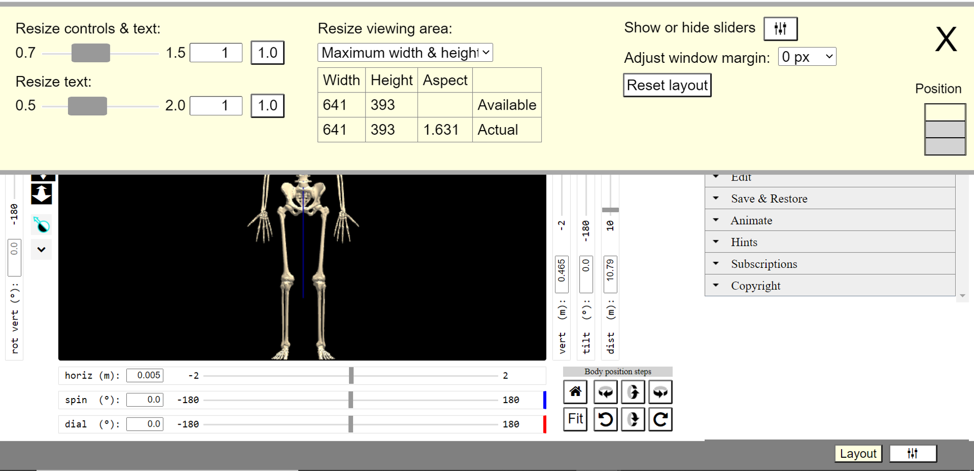
Most of KineBody Pro's layout adjustments are housed in a special panel (Figure 5), which differs from other KineBody control panels in several respects:
* Most importantly: controls in this panel are of fixed size, and its font-sizes are constant, unaffected by any other layout controls!
* Also: This panel is independent of other KineBody Pro panels, appearing atop the other controls & viewing area. It can be shown or hidden, and relocated vertically (to one of 3 levels), but otherwise can't be adjusted.
Miscellaneous
A few additional things to understand:
All of your custom layout settings are saved in your browser’s storage area. They’re automatically restored whenever you restart the KineBody Pro app.
When you resize the window, or make any other customizations described above: the size of the KineBody human figure remains constant. Equivalently, the distance to the body doesn’t change. (If you want to refit the entire body after the viewing area changes, you can use the Fit button).
The KineBody Pro layout is dependent on the size of the window or screen, and on its current ‘zoom’ level. Neither of these can be controlled by the KineBody Pro app. If you're using our Webapp edtion, you can change the window size using your standard operating system controls, and your browser provides the zoom controls. [Your operating system may have its own zoom or display scale controls, but those will affect all of your apps, not just KineBody Pro.] If you're using our Android edition, you can change the zoom level in the Settings panel (>Display>Screen zoom). [Again, that setting will affect all apps]. (Please see the documentation for those products, for more information).
The zoom level can be used to invoke some ‘special tricks’ regarding the layout. Further details are provided in the Tips and Tricks section.
Instructions
Access & Move the Layout panel
| To do this: | Proceed as follows: |
| Show the Layout panel |
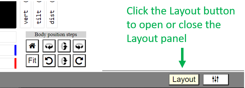
Result: The Layout panel appears atop the other controls (positioned where you left it last, or else on top). |
| Hide the Layout panel |

(or, Click the [ Layout ] button ) |
| Move the Layout panel |
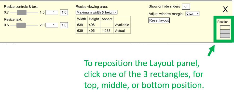
|
Resize Controls &/or Text
Resize Cursor
Resize the Viewing Area
As explained in the Overview, the 3D viewing area will be sized automatically, when you first launch the app and whenever you change the window size . By default, the layout mechanism makes the viewing area as large as possible, after allocating space for controls. Not surprisingly, we call this method of sizing ‘maximum width & height’.
Relative to this maximum size, you can reduce the viewing area dimensions. This capability is provided primarily as a way to control the size of images created via the [Save Image] button, as the saved images are identical to the viewing area in shape & content. [The actual size of the image will depend on the settings for zoom or display scale, that you setup in your browser &/or operating system. For more details, please see the Finer Points section]. If you want an image larger than the current ‘maximum width & height’, there’s no direct way to do it from the KineBody Pro app. (However, there is a ‘special trick’, involving the browser or app zoom setting, that can help. For more information, please see the Tips & Tricks section. For the present discussion, assume that the browser or app zoom remains unchanged).
You can change the viewing area dimensions several ways, as provided by the ‘Resize viewing area’ menu. As shown in Figure 6, these options fall into 3 major categories:
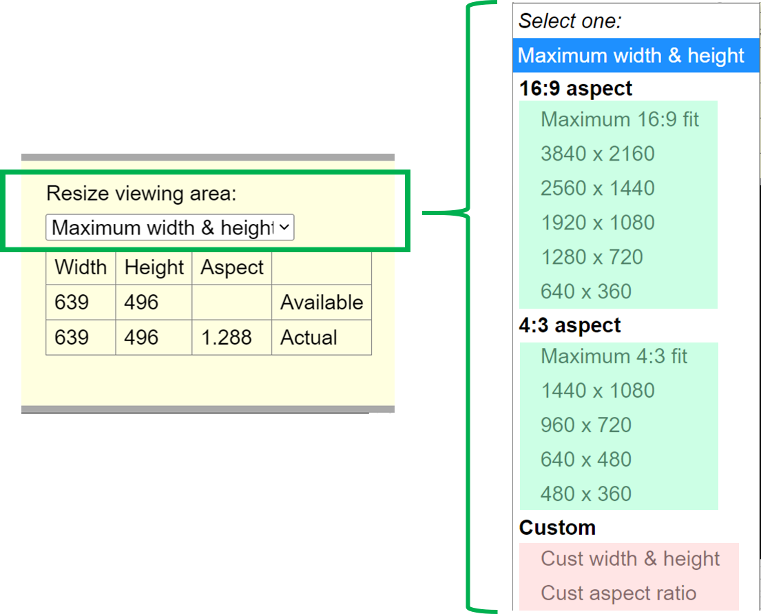
Maximum width & height [default]: After the outer controls are fit to the edges the window, the viewing area expands to fill the remaining central region.
Predefined dimensions : Under the menu sections headed '16:9 Aspect' or '4:3 Aspect', you can directly choose standard image sizes such as 640x480 (pixels). Alternatively, you can select a standard aspect ratio (width/height): The options 'Maximum 16:9 fit' and 'Maximum 4:3 fit' resize the viewing area so that at least one of the dimensions matches the current maximum width or height, and the other dimension is calculated to give the desired w/h proportion. This is useful if you plan to rescale the image later. For example if you choose a ‘maximum 4:3 fit’, the resulting image could be sized at 1000x750 px, which you can use as is or scale down to a standard size, e.g. 640x480.
Custom dimensions : Under the menu section labeled 'Custom', you can specify any values you want, for width and height, or aspect ratio. Specify values by editing the number boxes in the 'Requested' row, in the table below the menu. Remember, the actual viewing area size may be smaller than your requested values, depending on the available dimensions.
Integer dimensions feature: If you specify a custom aspect ratio, the sizing algorithm has a special feature to force the dimensions to be integers, with the exact ratio of w/h. This feature works for any aspect ratio defined using 2 or fewer decimal places. For example, if you specify an aspect ratio of 1.25, and the maximum height is 201, the width will be set to 250 ( & not 251.25, = 201 * 1.25), as that’s the largest integer size that gives the exact aspect ratio value for a height less than or equal to 201.
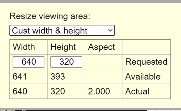
To help you understand the limitations on viewing area size, a table is provided in the Layout panel, below the ‘Resize viewing area’ menu (Figure 7). The table shows 2 or 3 rows: Requested, Available, and Actual values for each dimension or ratio.
-
Requested: The dimensions you chose from the ‘Resize viewing area’ menu. This row of the table may present different information, depending on your menu selection (Figure 8).
-
Available: the current maximum for each dimension. These dimensions are dictated by the current window size and the size of controls area.
Actual: the true dimensions, which is less than or equal to the maximum.
Some examples of different content in the 'Requested' row are shown below:

-
a) The entire 'Requested' row is omitted, when you select ‘maximum width and height’.
-
b) The width & height are blank, if you selected an aspect ratio option.
-
c) & d) The table presents editable value boxes, when you choose either custom width & height or custom aspect ratio.
Finer Points
An image saved via the Save Image button will normally have the exact same shape and content as the viewing area. The actual image size will depend on the zoom &/or scale settings within your browser or operating system controls. For convenience, we'll call these the 'external zoom' settings, in the discussion that follows.
When the external zoom set to 1.0 or 100%, the saved image will be exactly the same size as the screen image. That is, each image pixel represents 1 screen pixel.This may often be the case, for desktop/laptop devices. For our Android devices, the image size will generally be smaller than the size depicted on the screen. That is, each image pixel will generally correspond to more than 1 physical pixel. Generally, the ratio of the physical pixels to image pixels is a simple value composed of small integers: 3:2, 4:3, 2:1, etc. Thus, for instance, if your screen width is 2000 (physical) pixels, and the pixel ratio is 4:3, a full size screen capture (taken using some 3rd party app), would be 1500 pixels wide. The KineBody Pro viewing area would then be around 1000 pixels wide (because it's about 2/3 the width of the overall KineBody Pro window).
Note that the custom viewing area dimensions can't be larger than the 'Available' dimensions, which are governed by the current window size, controls & text scales, sliders on/off setting, and window margin. Also, when the viewing area is smaller than the Available size, the automatic layout logic (in Automatic Layout Features, paragraph (b)) changes: in this case, the controls contract to fit tightly around the viewing area, and there may be a white region outside of the controls.
Tips & Tricks
This section offers some advice on how to effectively use KineBody Pro’s layout controls. There are two main topics : A) how to maximize the viewing area, for best viewing & usability, and, B) how to save large images, when using the Save Image button.
A) Maximize the Viewing Area
To maximize the viewing area, you can use any of several techniques (in any order):
-
Webapp users: Use operating system controls to maximize the browser window, &/or use the browser’s Fullscreen capability (available in most browsers near the zoom controls).
-
In the Layout panel, make sure that the 'Resize viewing area' mode is 'Maximum width & height' (Figure 9B).
-
Hide the sliders, if you don’t need them, by using the either of the Show/Hide Sliders buttons (Figure 9C).
-
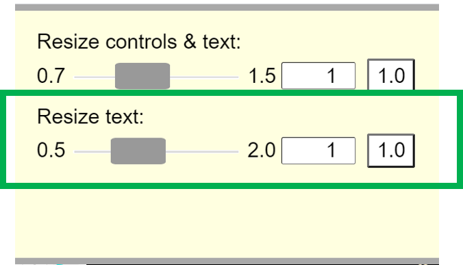
Use the controls ‘Resize controls and text’ and then ‘Resize text’, to reduce the area allocated for controls, to a size where you can still use & read them, comfortably (Figure 9A).
Webapp users: Your browser may show a ‘download toolbar’ at the bottom of the browser window (Figure 10), after saving files. Close it if you aren't using it.

Figure 10. Chrome's download toolbar -
Webapp users: Reduce the browser zoom level: this causes the controls area to shrink, making more room for the viewing area.

Those steps steps will work in most cases, to give a usefully large viewing area. However, there’s one more trick you may find useful, if you have a large screen, or you need to keep the sliders visible, or the lowest setting for 'Resize controls & text'(0.7) doesn’t go small enough:
Special method:
-
Omit technique (ii) above. Instead, reduce the window size, so it fills a smaller portion of the screen (say, 2/3 as tall & wide).
-
In the Layout panel, press the [Reset layout] button. This will cause the layout to rescale into the smaller window, using default proportions.
-
Now, maximize the window, so it fills the screen. Then, use the ‘Resize controls & text’ adjustment to further optimize the layout.
-
If necessary, redo steps (a)-(c), starting with a progressively smaller window size in (a).
-
B) Save Large Images
As mentioned previously, images created using the [Save Image] button are scaled copies of the viewing area: they have the same shape and content, and their dimensions are scaled from the viewing area width & height; the scale factor is determined by your 'external zoom' settings, i.e., your browser zoom level, &/or Android 'screen zoom' setting or operating system display scale. Of these, you should probably avoid changing the Android or operating system zoom controls, as these will affect the view for all your apps. In contrast, changing the browser zoom only affects the current website, so you can limit its effect to KineBody Pro scaling. So, this section will focus on increasing image sizes by reducing your browser zoom level.
Browser zoom level is set in the browser’s main menu (typically, upper right corner), or for Mac users, via its ‘View’ menu.
If you change the zoom level, the ratio between image pixels and screen pixels will change, by a factor approximately equal to the inverse of the zoom level. For example: when the zoom is 80%, the image size will be (roughly) 1.25 times larger than the viewing area size (in pixels, in each direction). [This relation is approximate because the controls around the viewing area shrink as well, making additional room for the viewing area to expand].
Note that the 'Available' and 'Actual' image dimensions (displayed in the 'Resize viewing area' table) automatically change to reflect the effect of any zoom changes. As a result, the size of the saved image is always shown as the 'Actual' value.
Here’s a stepwise procedure, including an example where the desired image size of 1280x720 pixels is too large for the original Available viewing area.
Step |
General Procedure |
Example & Notes |
| 1 | Open the Layout panel, and check the 'Available' dimensions for the viewing area. If both Available dimensions are larger than your desired image size, you can skip ahead to Step 3. Otherwise, continue to the next step. |
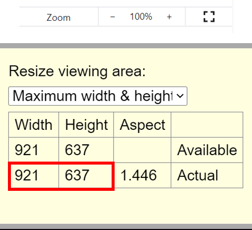
The Available size (921 x 637) is smaller than the desired size (1280 x 720), so continue to step 2. |
| 2 | Ensure that the viewing area resize mode is set to 'Maximum width & height'. Then, reduce your browser zoom level, until the Available dimensions are larger than the desired size. |
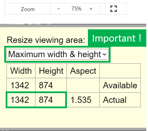
When the zoom is reduced to 75%, the Available dimensions become sufficiently large. |
| 3 | Set the desired image size using an appropriate option from the ‘Resize viewing area’ menu. |
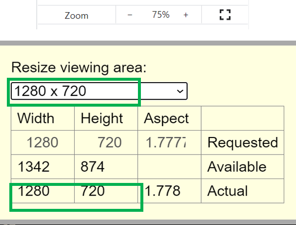
The desired size (1280x720) is one of the predefined sizes in the menu, so just select that option. (If none of the predefined sizes match the desired, select the 'Custom width & height' option, & fill in the width & height values). |
| 4 | Press the Save Image button. |
The button may be difficult to find or read, if the zoom is very low. If so, increase its size via the ‘Resize controls & text’ slider. Note that you can leave the Layout panel open, atop the viewing area, while creating an image - the image will be created from the underlying viewing area content, and the Layout panel will be ignored. |
| 5 | Revert any special settings: zoom level, controls & text, viewing area. If you normally use the default layout, you can easily restore it via the 'Reset layout' button. |
|
